
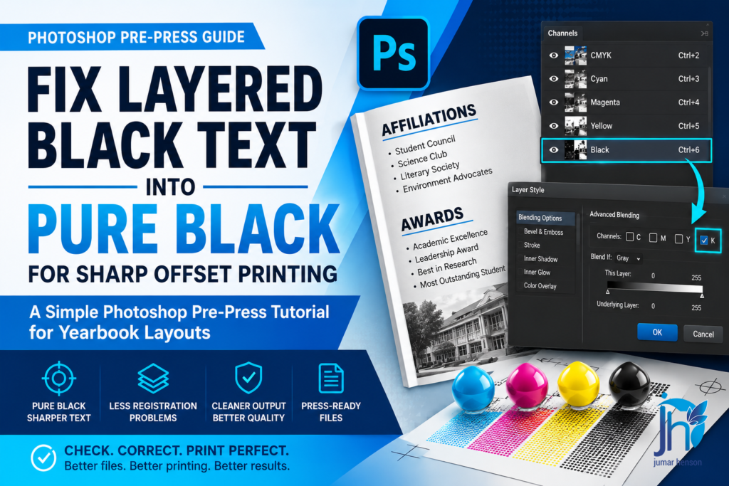
A Simple Photoshop Pre-Press Tutorial for Yearbook Layouts
Fix Layered Black Text into Pure Black for Sharp Offset Printing.
When schools create yearbooks, many of the layouts are made by the yearbook publication staff. Some students and advisers use Photoshop because it is easy for them to edit photos, add text, and design pages.
But during offset printing, some hidden problems appear.
One common problem is called Layered Black Text.
At first, the text looks perfectly fine on the computer screen. The black text looks dark and clean. But after printing, the text may become blurry, shadowed, or slightly out of register.
This usually happens because the black text is not using Black ink only.
Instead, it also contains:
- Cyan
- Magenta
- Yellow
This is called Rich Black or Layered Black Text.
In offset printing, small text should usually print on the Black plate only. If the text uses all CMYK colors, the printing plates may not align perfectly. Even a tiny movement can make the text look blurry.
This tutorial will show one practical way to fix that problem inside Photoshop.
But remember:
Fixing layered black text is case-to-case.
Different files may require different solutions depending on:
- How the text was created
- The layer effects used
- The blending settings
- The file structure
- The designer’s workflow
This guide shows one common method used during pre-press checking for yearbook layouts submitted by school publication staff.
Why This Problem Happens
Many students and layout artists focus only on appearance.
They want the text to look darker and stronger on screen.
So they accidentally create text using all CMYK colors.
Sometimes this happens because:
- The text style was copied from another file
- Layer effects were added
- Rich Black swatches were used
- Imported elements already contained CMYK values
- Photoshop automatically applied blending settings
The problem is not always visible immediately.
Usually, the issue is discovered during:
- Pre-press checking
- PDF inspection
- Plate preview
- Actual printing
That is why checking files before CTP output is very important.
What Happens During Printing
In offset printing, each color has its own printing plate.
There is:
- Cyan plate
- Magenta plate
- Yellow plate
- Black plate
If black text appears on all four plates, the machine must align every plate perfectly.
But in real printing conditions, tiny movements can happen.
This creates:
- Fuzzy text
- Double images
- Color shadows
- Dirty-looking letters
- Hard-to-read body text
This is very noticeable in:
- Small fonts
- Thin text
- Paragraphs
- Lists
- Captions
For yearbooks, this can become a serious quality issue.
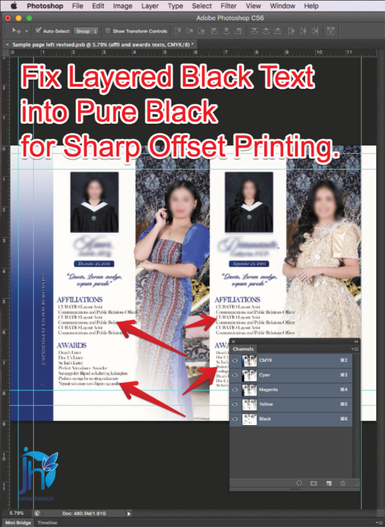
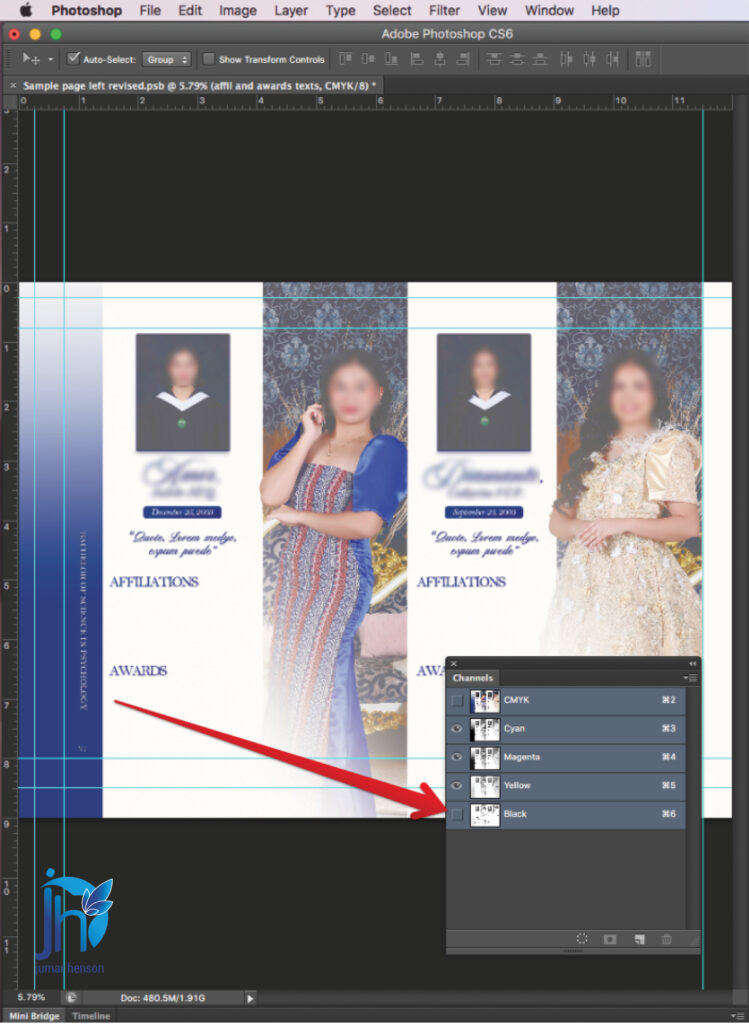
The Actual Yearbook Layout Problem

In this example, the Photoshop file came from a yearbook publication staff.
The layout looked good at first.
But after checking the Channels panel, the text under:
- Affiliations
- Awards
was found to be Layered Black Text.
This means the text was not printing on the Black channel only.
Instead, it was also appearing on:
- Cyan
- Magenta
- Yellow
This needed correction before offset printing.
Step 1: Check the Color Mode
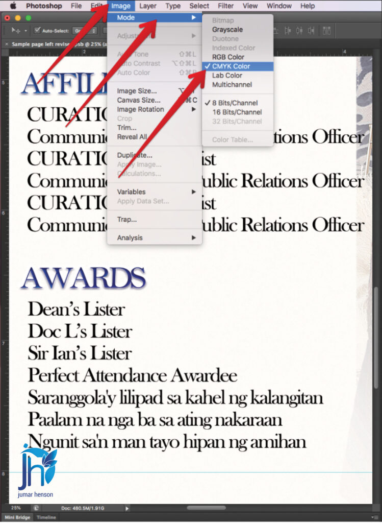
Before editing anything, first check the document color mode.
Go to:
Image → Mode
Make sure:
CMYK Color
is selected.
Why?
Because offset printing uses CMYK colors.
If the file is still in RGB mode, the color behavior will not match the actual printing output.
Always confirm this first during pre-press checking.
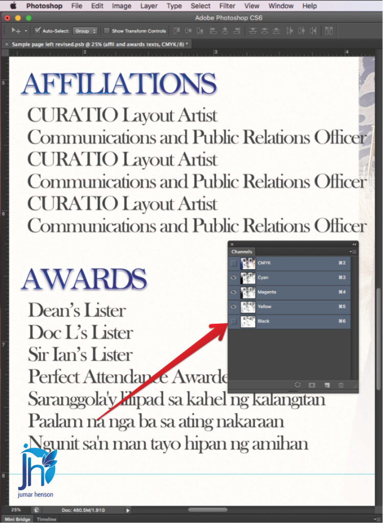
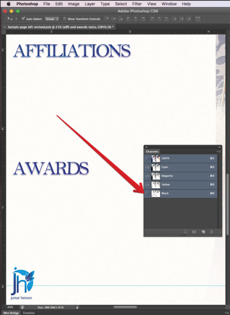
Step 2: Open the Channels Panel
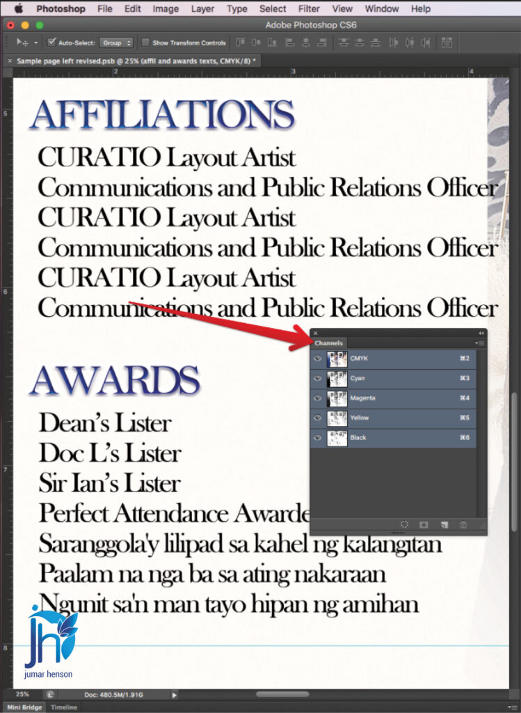
Next, go to:
Window → Channels
This panel shows the printing plates used in the document.
You will see:
- Cyan
- Magenta
- Yellow
- Black
Now inspect the black text carefully.
If the text appears inside the Cyan, Magenta, and Yellow channels, then it is considered Layered Black Text.
This means the text is not Pure Black yet.
Why Pure Black is Better
Pure Black means the text only uses the Black channel.
This gives several advantages:
- Sharper text
- Cleaner edges
- Better readability
- Less registration problems
- Safer offset printing output
For body text and small fonts, Pure Black is usually the safer choice.
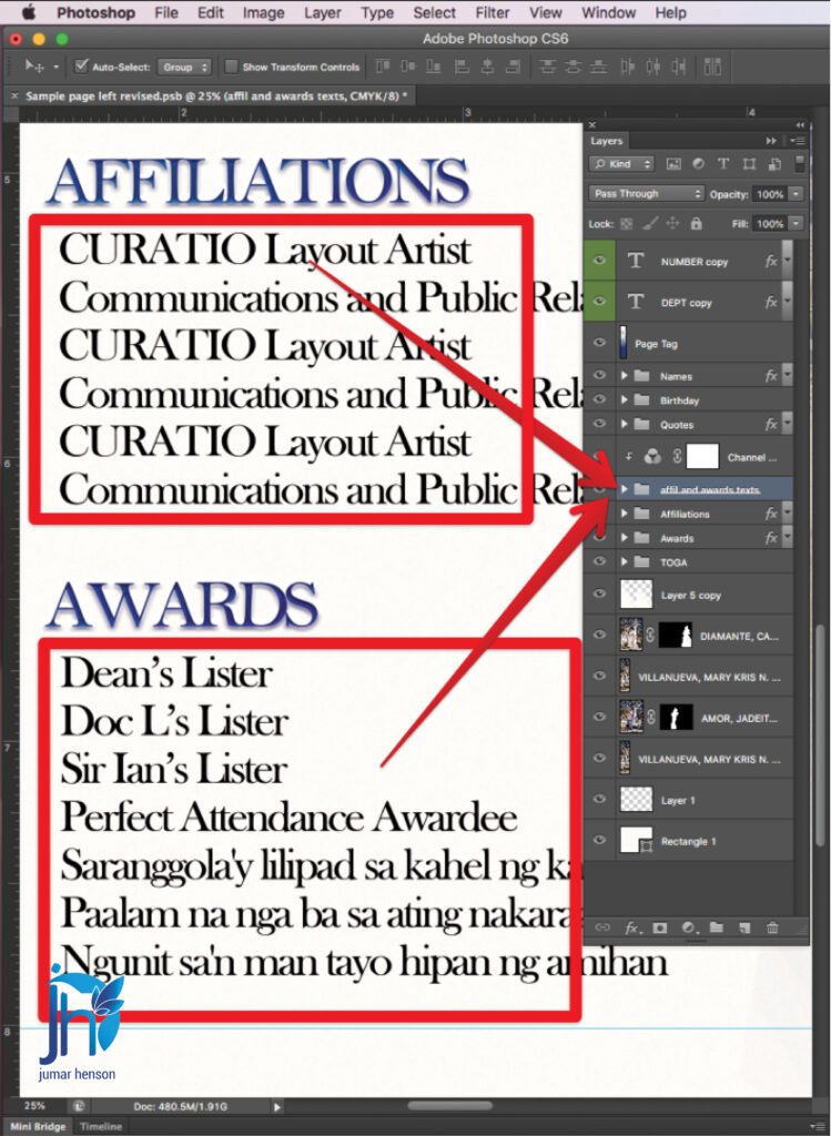
Step 3: Open the Layers Panel
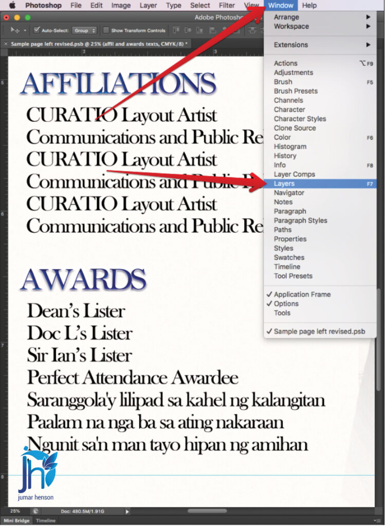
Now go to:
Window → Layers
Find the text layer causing the problem.
Sometimes the text is inside:
- A folder
- A grouped layer
- A styled text effect
In this example, the problematic text was inside:
“affil and awards texts”
Take your time locating the correct layer.
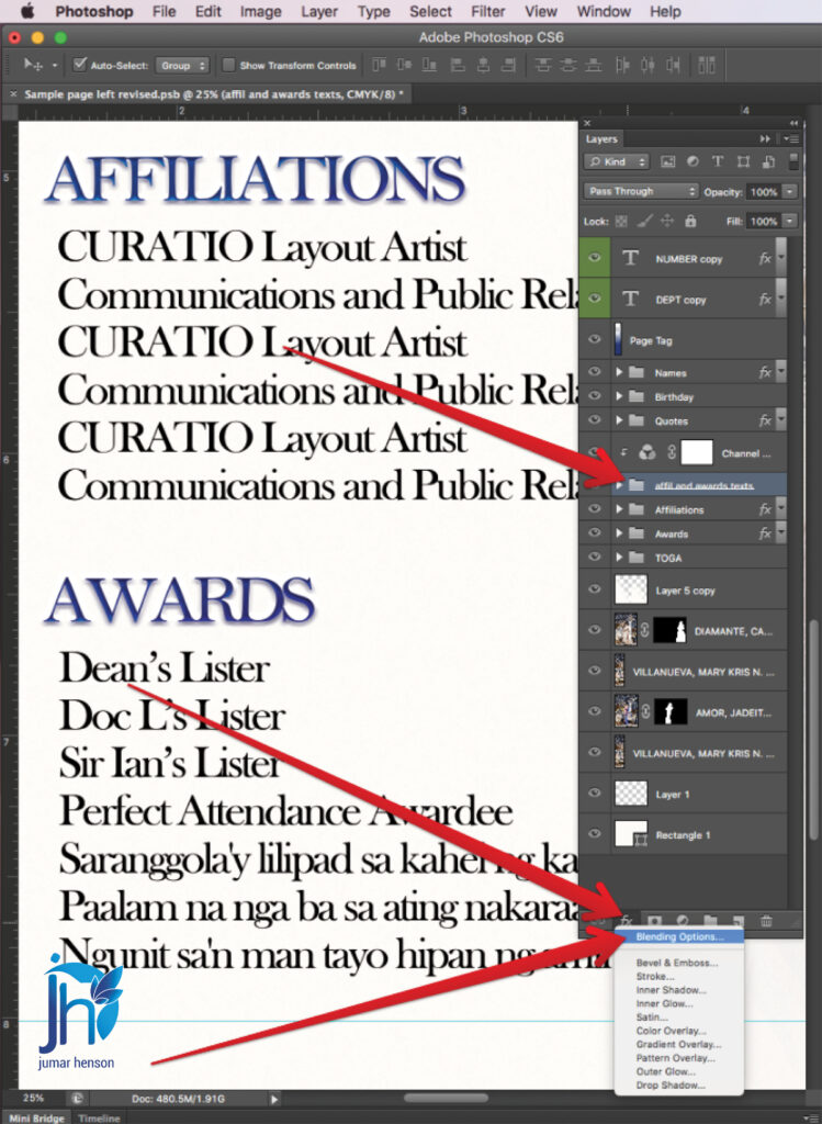
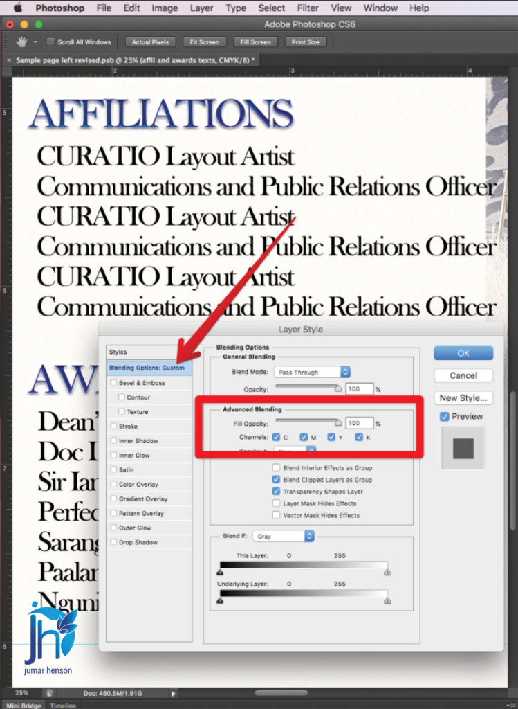
Step 4: Open Blending Options
Right-click the text layer or folder.
Then choose:
Blending Options
This opens the Layer Style window.
Inside this panel, you will find several settings that affect how the layer behaves.
Step 5: Adjust the Advanced Blending Settings
Inside the Layer Style dialog box, look for:
Advanced Blending
Under Channels, you will see:
- C
- M
- Y
- K
Normally, all channels are checked.
That means the text is printing on all CMYK plates.
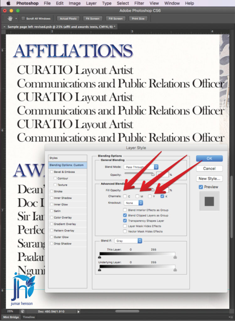
To convert the text into Pure Black:
Uncheck:
- C
- M
- Y
Leave only:
- K
checked.
Then click:
OK
This tells Photoshop to print the text only on the Black plate.
Step 6: Verify the Correction
Now go back to:
Window → Channels
This is the most important checking step.
Turn OFF the visibility of the Black channel.
If the correction worked correctly:
The text should disappear completely.
Why?
Because the text is no longer using Cyan, Magenta, or Yellow inks.
Only Black remains.
Step 7: Confirm the Pure Black Output

Turn the Black channel back ON.
Then hide:
- Cyan
- Magenta
- Yellow
If the text still appears sharp and visible, then the correction was successful.

Your text is now Pure Black.
This is the ideal setup for clean offset printing.
Why Pre-Press Checking Matters
Many printing problems happen because files were never checked properly before production.
Sometimes clients submit files very late.
Sometimes school publication staff are still learning Photoshop.
Sometimes layouts are rushed because graduation deadlines are near.
Because of this, hidden problems are common.
That is why pre-press checking is very important in the printing industry.
A small mistake in the file can create:
- Delayed printing
- Plate remakes
- Wasted paper
- Ink problems
- Reprinting expenses
- Client complaints
Professional checking helps avoid these costly issues.
Common Places Where Layered Black Text Appears
This issue is very common in:
- Yearbooks
- School magazines
- Souvenir programs
- Newsletters
- Books
- Tabloids
- Brochures
Especially when layouts are created in Photoshop instead of Adobe InDesign.
Final Result
After correcting the blending channels, the text now prints only on the Black plate.
The result is:
- Cleaner text
- Sharper letters
- Better readability
- Professional offset printing quality
This simple adjustment can greatly improve the final printed output.
Especially for school yearbooks where names, captions, and lists must remain clear and readable.
Final Thoughts
Every layout file is different.
Some layered black text problems are simple.
Others are more complex.
That is why fixing layered black text is always case-to-case.
But learning how to inspect the Channels panel and understand Pure Black output is an important skill in pre-press production.
If you work with:
- Yearbooks
- School publications
- Offset printing
- Photoshop layouts
then this checking process can help you avoid many printing problems before they happen.
A few minutes of checking can save hours of correction during production.
And in printing, prevention is always better than reprinting.
Need Help with Yearbook Layout Pre-Press Checking?
We help printing press companies and school publication teams prepare cleaner and safer files for offset printing.
Services include:
- Yearbook layout servicing
- Photoshop checking
- Adobe InDesign layout
- Dummy preparation
- PDF exporting
- Imposition making
- CTP-ready file preparation
- Unlimited revisions support
Helping reduce printing problems during busy graduation season.
Click the link here: Yearbook layout support