
The 15 Principles of Professional School Newspaper Layout Every Publication Team Should Know
Primary Keyword: Professional school newspaper layout
Introduction
The 15 Principles of Professional School Newspaper Layout Every Publication Team Should Know. Have you ever looked at an award-winning school newspaper and wondered why it looks so polished and organized?
You might think it is because the publication has more talented students, better computers, or expensive software.
Those things can help.
But they are rarely the real reason.
The biggest difference between an average publication and a professional-looking one is the system behind the design.
Professional layouts are planned before anyone opens Adobe InDesign. Every headline, photo, column, caption, and area of white space has a purpose. Nothing is placed randomly.
A strong layout follows clear design principles that make the publication easier to read, more visually appealing, and more consistent from the first page to the last.
Many school publication teams face the same problems every year.
Articles arrive late.
Photos vary in quality.
Different layout artists use different fonts.
Margins change from page to page.
Files become difficult to manage.
Advisers spend hours correcting alignment, spacing, typography, and other layout problems before the issue can finally be printed.
These problems are common.
But they are not unavoidable.
Strong publication teams do not depend on last-minute fixes. They use repeatable systems that help writers, editors, photographers, layout artists, and advisers work toward the same goal.
That is why learning Adobe InDesign alone is not enough.
Adobe InDesign is the tool.
The real skill is knowing how to organize information, guide the reader’s attention, maintain visual consistency, and build a workflow that the entire publication team can follow.
Whether you are a campus journalism adviser, editor-in-chief, layout artist, or student publication staff member, understanding professional school newspaper layout can improve both the appearance of your publication and the way your team works.
In this guide, you will learn 15 essential principles for creating organized, balanced, readable, and contest-ready school newspapers.
These principles can be applied to broadsheets, tabloids, magazines, and digital school publications.
You do not need to master all 15 at once.
Start with one.
Practice it consistently.
Then move to the next.
Over time, these small improvements can transform your publication from something that simply looks “student-made” into a newspaper that communicates with clarity, confidence, and professionalism.
Principle 1 — Plan Before You Design
One of the biggest mistakes new layout artists make is opening Adobe InDesign before they have a plan.
As soon as the software opens, they begin dragging text boxes, placing photos, testing fonts, and moving objects around the page.
Hours later, the layout still feels crowded, unbalanced, or unfinished.
The problem is not creativity.
The problem is that the planning stage was skipped.
Professional designers know that a strong layout begins long before the software is opened.
Every Great Publication Starts With a Plan
Think of a newspaper as a building.
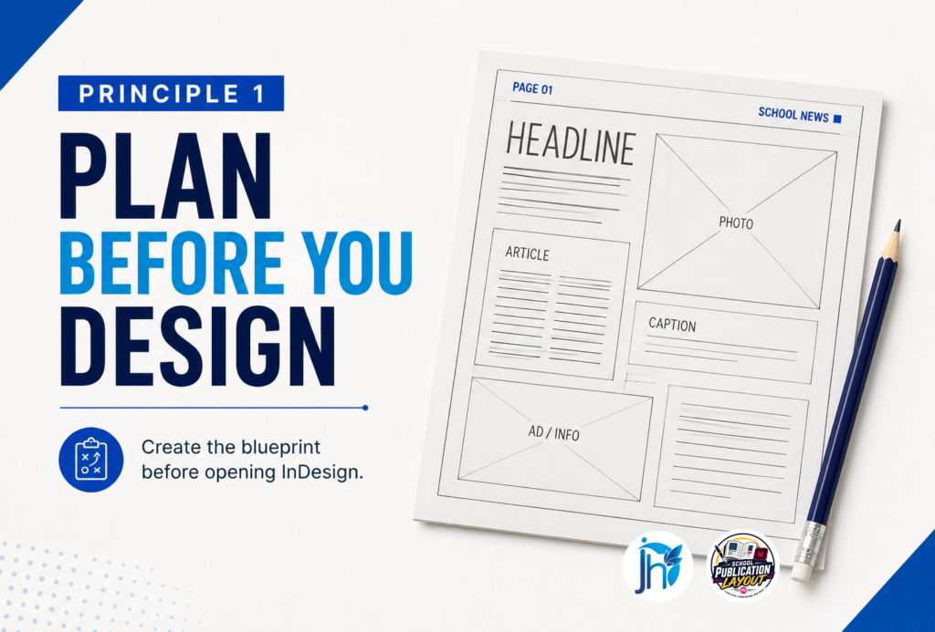
An architect does not begin by choosing the paint color. The architect first creates a blueprint that shows where the rooms, hallways, and doors belong.
A publication works in much the same way.
Before layout begins, the editorial team should already know:
- Which stories will appear on each page.
- Which story is the lead.
- Which photos will be used.
- How much space each article needs.
- Where illustrations, infographics, or advertisements will go.
- Which pages should share a similar visual style.
This planning process is often called dummy making or page planning.
A dummy acts as the publication’s blueprint. It gives the entire team a clear picture of the publication before detailed layout work begins.
Without a dummy, layout artists often spend hours rearranging articles because important decisions were never made before layout started.
Planning Reduces Revisions
Many advisers experience the same frustrating cycle.
A student finishes a page.
The adviser reviews it.
Then major changes are requested.
The lead story needs to move.
A photo needs to be replaced.
The headline is too long.
An article is missing.
The student has to redesign most of the page.
This does not always mean the student lacks layout skills.
Often, the problem started earlier.
Important editorial decisions were made after layout had already begun.
Good planning reduces unnecessary revisions.
When the editorial team agrees on the page structure early, layout artists can spend their time refining the design instead of rebuilding the page.
Planning Helps the Entire Team
A school publication is never created by the layout artist alone.
Writers, editors, photographers, cartoonists, proofreaders, and advisers all contribute to the final publication.
Without a clear plan, everyone may work independently.
That can lead to:
- unclear responsibilities,
- missed deadlines,
- scattered files,
- missing photos,
- incomplete articles,
- and repeated revisions.
A short planning meeting before layout begins can help everyone understand:
- their responsibilities,
- page assignments,
- production deadlines,
- required photos,
- and revision schedules.
Instead of reacting to problems, the team works from the same plan.
What Should Be Planned First?
Before opening Adobe InDesign, prepare these essentials:
- A completed page dummy.
- Final or nearly final article assignments.
- Photo selections.
- Headline priorities.
- Page dimensions and margins.
- Editorial deadlines.
- File naming conventions.
- Folder organization.
The more important decisions you make before designing, the smoother the production process becomes.
Professional Tip
Do not judge a layout only by how attractive it looks during the first hour of work.
Also ask:
How much will we need to change after review?
A well-planned page is easier to design, easier to revise, and easier to finish on time.
For a school publication team, planning is not extra work.
Planning is what prevents unnecessary work later.
Want to make your school paper layout process more organized?
Learn a practical workflow for planning your pages before you start designing.
→ Learn the School Paper Layout System
Principle 2 — Use a Grid System
If you compare a professional newspaper with one created by a beginner, you may not immediately notice the biggest difference.
It is not always the fonts.
It is not always the colors.
It is not even the photos.
One of the biggest differences is something most readers never see.
It is the grid system.
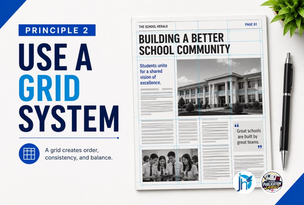
A grid is a set of invisible guides that helps organize every element on the page.
It helps determine where columns begin and end, how text aligns, where photos are placed, and how space is distributed.
Professional layouts look organized because they follow a structure.
Without that structure, pages can quickly become inconsistent.
What Is a Grid System?
Think of a grid as the framework of your page.
Just as the framework of a building supports everything built around it, a grid supports your design decisions.
Instead of placing objects wherever they happen to fit, you place them within a planned structure.
A basic newspaper grid usually includes:
- Page margins.
- Columns.
- Gutters between columns.
- Baseline alignment for text.
- Consistent spacing between elements.
Readers may never see these guides.
But they will notice the result.
The page feels organized, balanced, and easier to read.
Why Grids Matter
Without a grid, every layout artist makes different decisions.
One story starts too close to the edge.
Another photo sits slightly lower than the others.
Captions do not line up.
Columns have different widths.
Margins change from page to page.
Each mistake may seem small.
Together, they make the publication feel unprofessional.
A grid removes much of this guesswork.
Instead of asking:
“Where should I place this?”
you already have a structure to follow.
A Grid Creates Consistency
Imagine five students designing five pages.
If each student creates a completely different layout structure, the newspaper may feel like five different publications.
One page might use four columns.
Another might use three.
One page might have wide margins.
Another might have almost none.
A shared grid system solves this problem.
Every layout artist works within the same basic structure.
The pages can still look different, but they share a common foundation.
That gives the entire publication a stronger visual identity.
Grids Improve Readability
A newspaper exists to communicate information.
If readers struggle to follow a page, the design has failed—even if the page looks attractive.
A good grid helps readers:
- Follow stories from beginning to end.
- Find headlines quickly.
- Recognize related articles.
- Separate one story from another.
- Move naturally through the page.
Good design guides the reader without demanding attention.
Building a Simple Grid
You do not need a complicated system to begin.
For most school newspapers, start with these basics:
- Set consistent page margins.
- Decide on a fixed number of columns.
- Keep gutter widths consistent.
- Align text and images with the column structure.
- Maintain consistent spacing between stories.
Once your team agrees on these standards, use them throughout the publication.
You can later create specialized grids for feature, opinion, sports, or magazine-style pages.
Common Grid Mistakes
Watch for these common problems:
- Photos extending beyond column boundaries without purpose.
- Text boxes with inconsistent widths.
- Uneven gutters.
- Headlines that ignore the column structure.
- Objects placed simply because they “fit.”
Whenever you feel tempted to break the grid, stop and ask:
Does this improve the design, or am I fixing a problem that better planning could have prevented?
Sometimes breaking the grid is a deliberate design decision.
But it should be intentional—not accidental.
Professional Tip
Think of the grid as a guide, not a limitation.
A good grid gives your team a shared foundation while still leaving room for creativity.
The goal is not to make every page look identical.
The goal is to make every page feel like it belongs to the same publication.
When the grid is strong, layout artists spend less time guessing and more time designing.
Want your pages to look more organized and professional?
Learn how to use grids, columns, margins, and spacing to create cleaner school newspaper layouts.
→ Learn the School Paper Layout System
Principle 3 — Create Strong Visual Hierarchy
Imagine handing your newspaper to someone who has never seen it before.
They look at the page for three seconds.
What do they notice first?
If the answer is “I’m not sure,” your page may lack visual hierarchy.
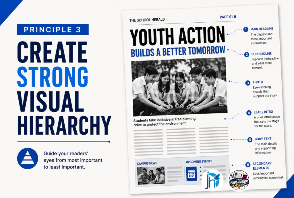
Visual hierarchy is the way a layout shows readers what is most important before they read a single word.
It organizes information so the eye naturally moves from the main story to supporting stories and other elements.
Professional newspapers do not expect readers to figure out where to look.
They guide the reader’s attention intentionally.
What Is Visual Hierarchy?
Visual hierarchy is the order in which readers notice information.
On a well-designed page, readers should quickly recognize:
- The most important story.
- Supporting stories.
- Photos and graphics.
- Captions and other supporting information.
- Body text.
This order does not happen by accident.
It is created through size, position, contrast, spacing, and typography.
Without hierarchy, every story competes for attention.
When everything looks equally important, nothing stands out.
The Lead Story Should Lead
Every page should have a clear focal point.
Usually, that is the lead story.
The lead story deserves stronger visual emphasis because it carries greater importance on the page.
You can emphasize it with:
- A larger headline.
- A stronger photo.
- More space.
- A prominent position.
- Supporting elements such as a deck or pull quote.
This does not mean making everything bigger.
It means making the most important story clearly stronger than the others.
If every headline is large and bold, readers cannot tell which story matters most.
Size Creates Importance
Readers naturally notice larger objects before smaller ones.
That is why headline sizes should reflect story importance.
For example:
- Lead story: Largest headline.
- Secondary story: Medium headline.
- Minor story: Smaller headline.
The same principle applies to photographs.
A strong lead photo may deserve more space than a small supporting image.
When size is used intentionally, readers understand the page before they begin reading.
Position Matters
Where you place an element affects how much attention it receives.
A strong story placed in a prominent position can establish the reading path for the entire page.
Avoid hiding your strongest content beneath less important stories or placing key information where readers are likely to overlook it.
Your layout should answer the reader’s first question:
“What should I read first?”
Contrast Creates Emphasis
Contrast helps important elements stand apart.
You can create contrast through:
- Font size.
- Font weight.
- White space.
- Photo size.
- Shape.
- Color, when appropriate.
For example, a bold headline above regular body text immediately signals importance.
Likewise, generous white space around a lead story can make it more noticeable.
Contrast should be purposeful.
Too much contrast creates visual noise.
Too little makes everything blend together.
White Space Supports Hierarchy
Many beginners think every empty area should be filled.
Professional designers know that white space has a purpose.
It helps readers recognize where one story ends and another begins.
It also gives important stories room to breathe.
When every inch of the page is crowded with text and images, readers can feel overwhelmed.
Sometimes the strongest design decision is deciding what not to place on the page.
Common Hierarchy Mistakes
Watch for these problems:
- Every headline uses the same size.
- Every photo is nearly the same size.
- There is no clear lead story.
- Too many bold elements compete for attention.
- Important stories are placed in weak positions.
- Decorative graphics distract from the journalism.
When readers do not know where to look first, the page becomes confusing.
Professional Tip
Before approving a page, step back and look at it from a distance.
Do not read the words.
Simply observe where your eyes go first.
Ask:
- Is that the most important story?
- Does my eye naturally move to the next story?
- Is the reading path clear?
If the answer is yes, your visual hierarchy is doing its job.
Professional layout is not about making every element stand out.
It is about helping the right elements stand out at the right time.
When readers never have to guess where to begin, your page becomes clearer, stronger, and easier to read.
Want readers to know exactly where to look first?
Learn how to use headlines, photos, size, spacing, and placement to create stronger visual hierarchy.
→ Learn the School Paper Layout System
Principle 4 — Limit Your Fonts
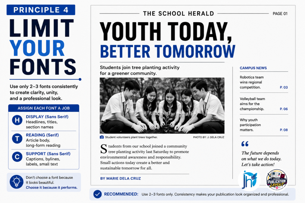
One of the quickest ways to make a school newspaper look unprofessional is to use too many fonts.
A layout artist discovers a new typeface and wants to try it.
Then another.
Then another.
Before long, one page contains five or six different fonts.
The result is a publication that feels inconsistent and difficult to read.
Professional publications usually use only a small number of carefully selected typefaces.
The goal is not to impress readers with your font collection.
The goal is to make the publication clear, readable, and visually consistent.
Why Too Many Fonts Hurt Your Layout
Every font has its own personality.
When too many personalities appear on one page, they compete for attention.
Instead of guiding readers toward the content, the typography becomes the content.
A professional publication usually needs only two or three font families.
For example:
- One font family for headlines.
- One font family for body text.
- An optional accent font for special elements.
This creates variety without creating chaos.
Create a Typography System
Do not choose fonts one page at a time.
Choose them for the entire publication.
Your system should define:
- Headline font.
- Subheadline font.
- Body text font.
- Caption font.
- Byline font.
- Pull-quote style.
- Photo-credit style.
- Page-number style.
Once these standards are established, every layout artist should follow them.
This is especially important when several students are working on different pages.
A shared typography system helps the entire publication feel like one newspaper rather than a collection of unrelated pages.
Use Font Styles to Create Hierarchy
You do not always need a new font to create variety.
Use different styles within the same font family.
For example:
- Bold for major headlines.
- Semibold for subheads.
- Regular for body text.
- Italic for photo credits or emphasis.
This creates contrast while keeping the design connected.
Prioritize Readability
A beautiful font is useless if readers struggle to read it.
When choosing a typeface, ask:
- Is it easy to read at smaller sizes?
- Does it remain clear when printed?
- Does it fit the tone of a newspaper?
- Can readers easily distinguish the letters?
Avoid decorative fonts for long passages of text.
A decorative typeface may work for a special feature title, but it should not interfere with the reading experience.
Remember:
A newspaper exists to communicate information—not to showcase unusual fonts.
Avoid Common Typography Mistakes
Watch for:
- A different font for every headline.
- Randomly mixing serif and sans-serif fonts.
- Excessive bold, italics, or underlining.
- Stretching or squeezing fonts to make them fit.
- Decorative fonts used for body text.
- Random font-size changes.
These choices make the page feel inconsistent and distract readers from the journalism.
Build a Typography Style Guide
A simple typography guide removes guesswork.
For example:
| Element | Typeface | Size | Style |
|---|---|---|---|
| Main Headline | Headline Font | 36–48 pt | Bold |
| Secondary Headline | Headline Font | 24–30 pt | Bold |
| Body Text | Body Font | 9–11 pt | Regular |
| Captions | Body Font | 8–9 pt | Regular |
| Bylines | Body Font | 9 pt | Italic |
| Pull Quotes | Accent or Body Font | 14–18 pt | Bold |
The exact sizes may change depending on your publication format and printing requirements.
What matters most is having a system that everyone follows.
Professional Tip
Readers should notice your stories before they notice your fonts.
Good typography supports the content without demanding attention.
When readers can comfortably move from the headline to the body text, your typography is doing its job.
Professional school newspaper layout is not about collecting the most beautiful fonts.
It is about choosing a small number of reliable typefaces and using them consistently across the publication.
The result is a newspaper that feels organized, credible, and professional.
Still struggling to make your typography look consistent?
Learn how to build a simple typography system your entire publication team can follow.
→ Learn the School Paper Layout System
Principle 5 — Use White Space Intentionally
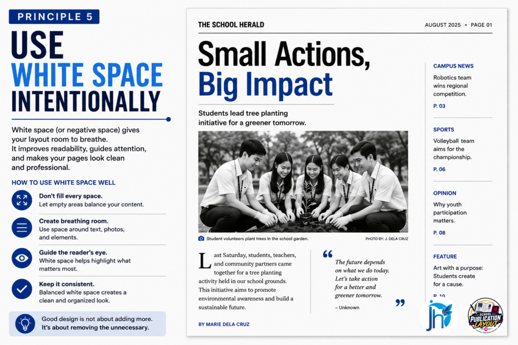
Many beginner layout artists are afraid of empty space.
When they see an open area on the page, their first instinct is to fill it.
They add another photo, another quote, another graphic, or another block of text.
Soon, every corner is occupied.
The result is a page that feels crowded, overwhelming, and difficult to read.
Professional designers think differently.
They understand that empty space is not wasted space.
It is part of the design.
What Is White Space?
White space, also called negative space, is the area around design elements that is intentionally left free.
It does not have to be white.
It can be any color.
What matters is that it gives the content room to breathe.
White space appears:
- Around headlines.
- Between columns.
- Around photos.
- Between paragraphs.
- Inside page margins.
- Between different stories.
Readers may not consciously notice it, but they feel its effect.
A page with enough white space feels calm and organized.
A page with too little white space feels busy and stressful.
White Space Improves Readability
Imagine walking into a classroom where every desk is pushed together with no room to move.
Finding your seat would feel uncomfortable.
A crowded newspaper page creates a similar feeling.
When stories are packed tightly together, readers struggle to see where one article ends and another begins.
Their eyes become tired more quickly.
White space gives each story room to breathe.
It separates ideas, reduces visual clutter, and helps readers focus on one piece of information at a time.
Good design is not about fitting the most content onto a page.
It is about making the content easier to understand.
White Space Creates Emphasis
One of the simplest ways to make something stand out is to give it more surrounding space.
Imagine two headlines.
The first is squeezed between photos and other stories.
The second has generous space above, below, and beside it.
Which one feels more important?
Usually, the second.
The headline did not become larger.
The surrounding space simply gave it more visual importance.
Professional designers use this principle often.
Instead of adding another decorative element to create emphasis, they sometimes remove an unnecessary element.
Sometimes less really is more.
White Space Improves Visual Balance
Every page contains visual weight.
Large photos feel heavy.
Bold headlines attract attention.
Dark areas appear stronger than light areas.
White space helps balance these elements.
Without enough space, one side of the page may feel crowded while another feels empty.
By adjusting the space around stories, designers create pages that feel stable and comfortable to read.
Balance is not only about placing objects.
It is also about managing the space between them.
Common White Space Mistakes
Watch for these problems:
- Filling every empty area.
- Placing stories too close together.
- Leaving too little space around headlines.
- Using decorative elements simply because there is room.
- Creating uneven gaps between stories.
- Making margins too narrow.
Before adding something to an empty area, ask:
Does this space need another element, or does the page need the empty space?
That question can prevent unnecessary clutter.
Professional Tip
Do not measure success by how much content you can fit onto one page.
Measure it by how easily readers can understand what is there.
A page does not look unfinished simply because it has empty space.
Sometimes that empty space is what makes the important content easier to see.
Does your newspaper page feel too crowded?
Learn how to use white space to make your pages cleaner, easier to read, and more professional.
→ Learn the School Paper Layout System
Principle 6 — Align Everything
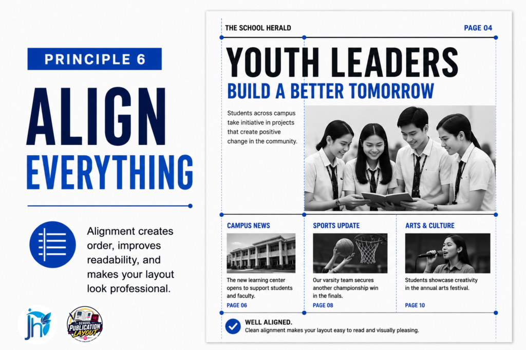
Have you ever looked at a page and felt that something was wrong even though you could not explain why?
The headlines looked fine.
The photos were good.
The stories were interesting.
Yet the page still felt messy.
Often, the problem is alignment.
Alignment is one of the simplest principles in editorial design, but it has a major effect on how professional a publication looks.
Professional layouts do not happen because every element is beautiful.
They happen because the elements have clear visual relationships.
What Is Alignment?
Alignment means placing elements so they line up with one another.
Headlines, photos, captions, text boxes, and graphics should have a visual relationship with the elements around them.
Nothing should appear randomly placed.
When objects align consistently, the page feels organized.
When they do not, the page feels chaotic—even when readers cannot identify the exact problem.
Think of alignment as creating invisible connections across the page.
Readers may never consciously notice those connections, but they immediately recognize the sense of order they create.
Why Alignment Matters
Imagine a classroom where every chair faces a different direction.
The room would feel disorganized before anyone even sat down.
Now imagine the chairs arranged in neat rows.
The room immediately feels orderly.
A newspaper works the same way.
When headlines, photos, and text boxes line up, the page becomes easier to scan.
Readers can focus on the stories instead of being distracted by inconsistent placement.
Good alignment quietly builds trust.
It tells readers that the publication has been carefully planned.
Use the Grid as Your Guide
Alignment becomes much easier when you already have a grid system.
Every element should respect that structure.
For example:
- Headlines should begin at consistent column edges.
- Photos should align with the columns.
- Captions should align with their photos.
- Text boxes should share common edges.
- Pull quotes should follow the established structure.
Instead of positioning objects only by eye, use guides and snapping features in Adobe InDesign.
These tools help you create precision quickly and consistently.
Align More Than the Obvious
Many beginners align only the large elements.
Professional designers also pay attention to small details.
Check that:
- Headlines begin on the same vertical line.
- Story text aligns with the headline above it.
- Captions have consistent widths.
- Photo credits appear in consistent positions.
- Page numbers follow the same placement.
- Section labels remain consistent from issue to issue.
These small improvements add up.
Readers may never point them out, but they contribute to the overall quality of the publication.
Consistent Spacing Supports Alignment
Alignment is not only about straight lines.
It is also about consistent spacing.
If two photos sit side by side, the space between them should feel intentional.
If one story has a large gap below its headline while another has almost none, the page feels uneven.
Consistent spacing reinforces alignment and creates rhythm throughout the layout.
Common Alignment Mistakes
Watch for:
- Headlines beginning at different positions.
- Photos slightly extending beyond column edges without purpose.
- Captions wider than their photos.
- Uneven spacing between stories.
- Text boxes shifted slightly left or right.
- Objects positioned manually instead of using guides.
Each mistake may seem minor.
Together, they create visual clutter that weakens the overall design.
Train Your Eyes
One of the best habits a layout artist can develop is checking alignment before considering a page finished.
Zoom out.
Look across the entire page.
Check the left edges.
Check the right edges.
Check the spacing.
Look for objects that appear slightly out of place.
A page can contain excellent content and still feel unprofessional because of small alignment errors.
Professional Tip
Use your grid and guides as your first line of defense.
Do not rely only on your eyes.
Let the software help you create precision.
A well-aligned page feels organized without calling attention to the alignment itself.
That is the goal.
Readers should notice the journalism—not the struggle behind the layout.
Want to eliminate those small layout mistakes that make a page look messy?
Learn how alignment, guides, grids, and spacing can make your school paper look more polished.
→ Learn the School Paper Layout System
Principle 7 — Balance Every Page
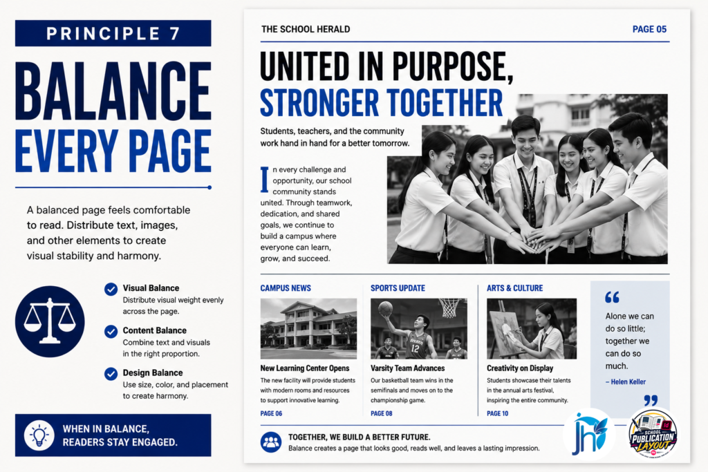
A page can be perfectly aligned and still feel wrong.
Why?
Because alignment creates order, but balance creates stability.
Balance is the way visual weight is distributed across a page.
Large photos, bold headlines, dark colors, graphics, and dense blocks of text all carry visual weight.
If too much weight is concentrated in one area, the page can feel heavy or unstable.
What Is Visual Balance?
Imagine holding a tray.
If all the weight is on one side, the tray becomes difficult to carry.
A newspaper page works in a similar way.
If one side contains a large photo, a huge headline, and several dark blocks while the other side contains only small text, the page may feel unbalanced.
Balance does not mean making both sides identical.
It means distributing visual weight so the page feels intentional and comfortable.
Symmetrical vs. Asymmetrical Balance
There are two basic approaches.
Symmetrical Balance
Both sides of the page have similar visual weight.
This approach often feels:
- Stable.
- Formal.
- Predictable.
- Organized.
It can work well for traditional news pages.
Asymmetrical Balance
The two sides are different, but the overall visual weight still feels balanced.
For example:
A large photograph on one side might be balanced by several smaller stories on the other.
Asymmetrical layouts can feel:
- Modern.
- Dynamic.
- Creative.
- Energetic.
Both approaches can work.
The important thing is intentionality.
Watch Your Visual Weight
Some elements naturally attract more attention than others.
For example:
- A large photo carries more weight than a small photo.
- A bold headline carries more weight than body text.
- A dark block attracts more attention than an open area.
- A large graphic can dominate a page quickly.
When reviewing a layout, look at the page as a whole.
Ask:
Where is the visual weight?
If everything heavy is clustered in one area, the page may need adjustment.
Balance Does Not Mean Equal
A common mistake is thinking that every part of the page must contain the same amount of content.
That is not necessary.
One story may occupy more space because it is more important.
One photo may be much larger because it carries stronger news value.
Balance is not about equal space.
It is about creating a relationship between the elements.
Use White Space to Balance the Page
White space is one of your strongest balancing tools.
If one area feels too heavy, you may not need to add something to the opposite side.
You may simply need to give the heavy area more breathing room.
Likewise, an empty area does not always need more content.
It may be helping balance the page.
Common Balance Problems
Watch for:
- Too many large elements clustered together.
- Heavy graphics on one side.
- A large photo surrounded by tiny elements.
- Large empty areas with no clear purpose.
- Too many bold headlines competing for attention.
- Similar visual weight across every story.
When every element is strong, the page becomes exhausting.
A balanced page gives important elements room to stand out.
Professional Tip
Squint at the page or view it at a small zoom level.
Do not read the text.
Look only at the shapes and visual weight.
Ask:
Does the page feel stable?
If one area immediately dominates without a clear reason, adjust the size, position, spacing, or surrounding white space.
Professional balance is not about making the page perfectly symmetrical.
It is about making the page feel intentional, stable, and easy to scan.
Does your page feel heavy on one side?
Learn how to balance photos, headlines, text, graphics, and white space so your pages feel more stable and engaging.
→ Learn the School Paper Layout System
Principle 8 — Make Headlines Clear and Strong
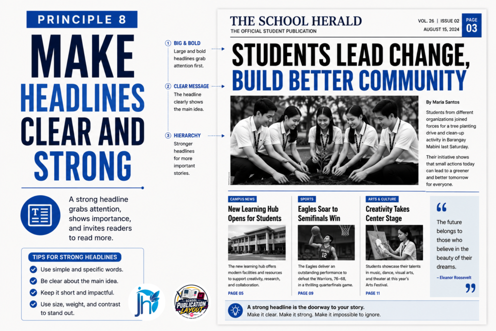
A headline is one of the first things readers see.
Before they read the article, they use the headline to decide whether the story is worth their attention.
That makes headline design an important part of newspaper layout.
A strong headline should do two things:
- Tell readers what the story is about.
- Make them want to continue reading.
A beautiful layout cannot rescue a confusing headline.
Make Headlines Easy to Understand
Avoid headlines that are clever but unclear.
Readers should not have to read the entire article to understand what the headline means.
A good headline gives enough information to establish the story while remaining concise.
For example:
Weak: “A Day to Remember”
Stronger: “Students Lead Coastal Cleanup Drive”
The second headline immediately tells readers what happened.
Use Headline Hierarchy
Not every headline should have the same visual strength.
Your typography should communicate story importance.
For example:
- Lead story: Largest and strongest headline.
- Secondary story: Medium-sized headline.
- Brief or minor story: Smaller headline.
This creates visual hierarchy and helps readers scan the page quickly.
If every headline is equally large and bold, readers cannot tell which story matters most.
Avoid Overdesigning Headlines
A headline does not need:
- multiple fonts,
- excessive effects,
- unnecessary outlines,
- large shadows,
- decorative graphics,
- or unusual shapes.
These techniques can make a headline harder to read.
Strong headlines usually depend on:
- clear wording,
- appropriate size,
- good typography,
- proper spacing,
- and strong placement.
The goal is communication, not decoration.
Use Subheads When Helpful
Long or complex stories can benefit from a short subhead or deck.
A subhead can provide additional context without making the main headline too long.
It can also help create a stronger visual structure.
Use it when it improves understanding—not simply because there is space available.
Avoid Awkward Headline Breaks
Pay attention to where your headline lines break.
A poorly broken headline can change emphasis or make the sentence difficult to understand.
Try to keep related words together when possible.
For example, avoid separating:
“School Publication”
into different lines unless the design requires it.
Small adjustments to headline width, size, or tracking can often create a cleaner break.
Professional Tip
Read every headline by itself.
Ask:
If I saw only this headline, would I understand the basic story?
If not, revise the wording before trying to solve the problem with design.
Good headline design begins with good headline writing.
Want your headlines to grab attention without looking overdesigned?
Learn how to create stronger headline hierarchy and make important stories stand out.
→ Learn the School Paper Layout System
Principle 9 — Treat Photos as Part of the Story
Photos are not decoration.
They are part of the journalism.
A strong photograph can communicate information, emotion, context, and credibility faster than a paragraph of text.
A weak photo can have the opposite effect.
It can make an otherwise strong page feel unfinished or unprofessional.
Choose Photos for News Value
When selecting photos, do not automatically choose the clearest image.
Choose the image that tells the strongest story.
Ask:
- Does it show the important people?
- Does it show what happened?
- Does it capture emotion or action?
- Does it provide useful context?
- Does it support the article?
A technically sharp photo is not automatically a good editorial photo.
News value comes first.
Use Strong Cropping
Cropping is one of the most important skills in publication layout.
A good crop removes unnecessary details and focuses attention on the subject.
A weak crop can:
- cut off important people,
- remove useful context,
- create awkward framing,
- or make the photo difficult to understand.
Before placing a photo, decide what the reader needs to see.
Then crop around that purpose.
Never Stretch Photos
This is one of the most common technical mistakes.
Never drag a photo wider or taller simply to make it fit.
Stretching distorts faces, buildings, objects, and other important details.
Always maintain the original proportions of the image.
If the photo does not fit, change the crop or adjust the frame.
Do not distort the image.
Match Photo Size to Importance
Not every photo deserves the same amount of space.
A major news photograph may deserve a large display.
A small supporting photo may only need a modest space.
Use photo size as part of your visual hierarchy.
The stronger the editorial importance, the more visual space the photo may deserve.
Use Captions Correctly
A caption should add information.
It should help readers understand:
- who is in the photo,
- what is happening,
- where it happened,
- when appropriate, when it happened,
- and why the moment matters.
Avoid captions that simply repeat the headline.
Also make sure the caption matches the actual image.
A wrong caption can damage the credibility of the entire publication.
Give Photojournalists Credit
Proper attribution matters.
Use consistent photo credits throughout the publication.
For example:
Photo by Juan Dela Cruz
or
Photo: Juan Dela Cruz
Choose one format and use it consistently.
This recognizes the photographer’s work and helps establish professional editorial standards.
Avoid Decorative Photo Placement
Do not use photos simply to fill empty spaces.
Every photograph should have a reason to be on the page.
If a photo does not add information, emotion, context, or visual support, consider removing it.
Sometimes a cleaner page with fewer strong photos is better than a crowded page filled with weak ones.
Professional Tip
Before placing a photo, ask:
What does this image add to the story?
If the answer is unclear, look for a stronger image.
A publication becomes more powerful when photographs are treated as journalism rather than decoration.
Are you using photos just to fill empty spaces?
Learn how to choose, crop, position, and caption photos so they actually strengthen your stories.
→ Learn the School Paper Layout System
Principle 10 — Make Readability the Priority
A beautiful newspaper is useless if readers cannot comfortably read it.
This is one of the most important principles in editorial design.
Your publication exists to communicate information.
That means readability must always come before decoration.
Choose a Comfortable Body-Text Size
Body text should be large enough to read comfortably in print.
For many school publications, a range around 9–11 pt may work well, depending on the typeface, page size, printing method, and publication format.
Do not shrink the text simply because you are trying to fit more words onto the page.
If an article is too long, solve the editorial problem first.
You might:
- Edit unnecessary words.
- Reorganize the article.
- Move supporting information elsewhere.
- Adjust the page plan.
- Use another page when appropriate.
Do not automatically make the text smaller.
Choose Readable Fonts
Your body font should remain clear when printed.
Test your chosen typeface at the actual size you intend to use.
Some fonts look excellent on a large computer screen but become difficult to read when printed at small sizes.
A good body font should have:
- clear letterforms,
- comfortable spacing,
- good print quality,
- and enough contrast against the background.
Manage Line Length
Very long lines are tiring to read.
Very short lines can make the text feel choppy.
Columns are useful because they create manageable reading widths.
The exact width will depend on your publication format, but the goal is simple:
Make the reader’s eyes move naturally from one line to the next.
Use Appropriate Leading
Leading is the vertical space between lines of text.
Too little leading makes paragraphs look crowded.
Too much leading makes the article feel disconnected.
Adjust leading until the text feels comfortable and open without wasting unnecessary space.
Watch Paragraph Structure
Large blocks of text can intimidate readers.
Use appropriate paragraph breaks and editorial structure.
For longer stories, consider:
- Subheads.
- Pull quotes.
- Short paragraphs.
- Lists when appropriate.
- Supporting graphics.
These elements can make a long article easier to navigate without distracting from the journalism.
Maintain Strong Contrast
Text must have enough contrast against its background.
Black text on a light background is usually easy to read.
Light text on a dark background can work for short elements, but large blocks of reversed text can be tiring.
Avoid placing body text over busy photographs or complex backgrounds.
Readability should always win.
Do a Real Print Test
Never judge readability only from your monitor.
Print the page.
Hold it at a normal reading distance.
Read several paragraphs.
Check:
- Font size.
- Leading.
- Line length.
- Contrast.
- Column width.
- Paragraph spacing.
A layout that looks fine at 150% zoom may not work when printed.
The reader sees the printed publication—not your InDesign workspace.
Professional Tip
Read your publication as a reader, not as a designer.
If you have to work hard to read it, your readers will have the same problem.
Design should make reading easier, not harder.
Beautiful design means little if readers struggle to read your stories.
Learn practical layout techniques for better typography, spacing, columns, contrast, and readability.
→ Learn the School Paper Layout System
Principle 11 — Maintain Consistency Across Pages
A professional newspaper should feel like one publication.
It should not feel like every page was designed by a different person using different rules.
Consistency creates that connection.
It helps readers recognize your publication’s visual identity and helps the production team work faster.
What Should Stay Consistent?
Your publication should establish standards for:
- Fonts.
- Headline styles.
- Body-text styles.
- Margins.
- Columns.
- Gutters.
- Captions.
- Byline treatment.
- Photo credits.
- Page numbers.
- Section labels.
- Color usage.
- Spacing.
These standards do not mean every page must look identical.
They simply provide a common visual language.
Use Paragraph and Character Styles
Adobe InDesign provides powerful tools for maintaining consistency.
Paragraph Styles can control:
- Body text.
- Headlines.
- Subheads.
- Captions.
- Bylines.
- Pull quotes.
Character Styles can control specific text treatments within paragraphs.
Once these styles are created, students can apply them instead of manually formatting every text box.
This saves time and reduces errors.
Use Master Pages
Master Pages are useful for repeating elements such as:
- Page numbers.
- Running heads.
- Section labels.
- Repeated graphic elements.
- Consistent margins and guides.
When the same element appears across many pages, build it into the system instead of recreating it manually.
This makes revisions easier and helps prevent inconsistencies.
Create a Publication Style Guide
A simple style guide can document your standards.
For example:
Typography
- Headline: Typeface A, bold.
- Body: Typeface B, regular.
- Caption: Typeface B, smaller size.
- Byline: Typeface B, italic.
Layout
- Standard margins.
- Standard column grid.
- Standard gutter.
- Standard caption spacing.
Branding
- Publication colors.
- Logo usage.
- Section labels.
Photo Standards
- Credit format.
- Caption format.
- Minimum image quality.
The exact standards are less important than having clear standards everyone can follow.
Consistency Helps New Students
School publication teams change every year.
Experienced students graduate.
New students join.
If the publication depends on memory, the system becomes difficult to maintain.
A documented style guide gives new members a starting point.
They do not need to guess:
- Which font to use.
- How large a headline should be.
- Where page numbers belong.
- How captions should look.
- How photos should be credited.
The system becomes easier to teach.
Consistency Does Not Mean Boring
Some students worry that standards will limit creativity.
They do not.
A strong system gives designers boundaries within which they can create.
You can still vary:
- Photo sizes.
- Story structures.
- Feature layouts.
- Graphic treatments.
- Visual emphasis.
The key is to make creative decisions within a recognizable publication identity.
Professional Tip
Create your visual standards once, document them, and teach them to every new publication member.
This reduces repeated explanations.
It also reduces the number of corrections advisers need to make.
When everyone follows the same system, the team spends less time fixing basic inconsistencies and more time improving the journalism.
Consistency is not about making every page identical.
It is about making every page feel like it belongs to the same publication.
Want your entire publication to feel like one professional newspaper?
Learn how to create consistent typography, spacing, styles, page elements, and layout standards.
→ Learn the School Paper Layout System
Principle 12 — Use Color With Purpose
Color can make a school newspaper more attractive and easier to navigate.
But too much color can quickly make a page feel chaotic.
Professional publications usually treat color as a design system rather than decoration.
Choose a Limited Color Palette
A publication does not need every color available in Adobe InDesign.
Choose a small set of colors and use them consistently.
For example:
- One primary color.
- One secondary color.
- Neutral colors such as black, white, or gray.
Your exact palette will depend on your publication’s identity.
The important thing is consistency.
Use Color to Organize Information
Color can help readers recognize sections and important information.
For example, you might use a specific color for:
- News.
- Features.
- Sports.
- Opinion.
- Special sections.
You can also use color for:
- Section labels.
- Pull quotes.
- Rules or lines.
- Small graphic elements.
- Highlight boxes.
The color should help readers understand the page.
It should not distract them from the journalism.
Avoid Overusing Color
A common beginner mistake is thinking that more color means a more creative design.
Usually, the opposite happens.
When every headline, box, line, and photo has a different color, nothing feels important.
The page becomes visually noisy.
Instead, ask:
What information needs emphasis?
Use color to support that answer.
Consider Printing
Remember that your publication may eventually be printed.
Colors can appear differently on a monitor and on paper.
A color that looks bright on screen may print darker or less vibrant.
If your publication will be printed professionally, test important colors before final production.
This is especially important when working with school printing schedules and limited production budgets.
Color and Readability
Color should never reduce readability.
Avoid:
- Light text on light backgrounds.
- Low-contrast combinations.
- Busy backgrounds behind body text.
- Excessive color inside long articles.
Color is most effective when it supports the content without competing with it.
Professional Tip
Before adding a color, ask:
What job is this color doing?
If the answer is simply “to make the page more colorful,” you may not need it.
Good color design is not about using more colors.
It is about using the right colors for the right purpose.
Not sure how much color your school paper really needs?
Learn how to use color strategically without making your pages look crowded or distracting.
→ Learn the School Paper Layout System
Principle 13 — Build a Repeatable Workflow
This may be the most important principle in the entire guide.
A beautiful layout is useful.
A beautiful layout that your team can repeatedly produce under deadline pressure is much more valuable.
School publications are team projects.
Writers, editors, photographers, cartoonists, layout artists, proofreaders, and advisers all depend on one another.
Without a clear workflow, production can quickly become chaotic.
Why Workflow Matters
Imagine this situation.
The writer submits an article.
The layout artist starts designing.
Later, the editor changes the article.
Then the photographer sends a new photo.
Then the adviser requests a different headline.
The layout artist has to rebuild the page.
This happens repeatedly.
The result is:
- Lost time.
- Repeated work.
- Confusing file versions.
- Missed deadlines.
- Frustrated students.
- Overloaded advisers.
The problem is not necessarily the people.
The problem is the workflow.
Create Clear Production Stages
A simple publication workflow might look like:
Planning → Writing → Editing → Photography → Copy Editing → Dummy → Layout → Proofreading → Final Approval → Export → Printing
Each stage should have a clear purpose.
More importantly, the team should know when a page is ready to move to the next stage.
Define Responsibilities
Every team member should know what they are responsible for.
For example:
Writers
- Submit complete articles.
- Follow word-count requirements.
- Provide accurate information.
Editors
- Review content.
- Check facts.
- Approve headlines.
Photographers
- Submit high-quality photos.
- Provide captions and credits.
Layout Artists
- Follow the grid.
- Apply typography standards.
- Maintain visual consistency.
Advisers
- Review completed work.
- Approve major changes.
- Guide the team rather than doing every task themselves.
Clear roles prevent work from falling through the cracks.
Use a Production Calendar
A production calendar helps the team see what must happen and when.
For example:
Monday: Article submission Tuesday: Editing Wednesday: Photo collection Thursday: Dummy preparation Friday: Layout Saturday: Proofreading and revisions
The actual schedule will vary by school.
The principle remains the same:
Give every stage a deadline.
Organize Your Files
A good workflow also includes file organization.
Create a consistent folder structure.
For example:
Publication 2026
- 01 Articles
- 02 Photos
- 03 Graphics
- 04 Dummies
- 05 InDesign
- 06 Links
- 07 Exports
- 08 Final PDF
Use clear file names.
For example:
Page01_News_Final.indd
instead of:
page1final2new.indd
Good file organization prevents confusion when multiple students are working on the same publication.
Build a Revision System
Revisions are normal.
The problem is uncontrolled revisions.
Use clear version names or a simple revision process so the team knows:
- Which file is current.
- Which changes are requested.
- Who approved the page.
- Whether the page is ready for export.
This prevents students from accidentally editing old versions.
Reduce Adviser Overload
A repeatable workflow should make the adviser’s job easier.
The adviser should not have to:
- Find missing files.
- Fix every spacing problem.
- Rebuild every page.
- Search for the latest article.
- Remind everyone of every deadline.
A good system allows the adviser to supervise production instead of carrying the entire production process.
That is one of the biggest benefits of a documented workflow.
Create Checklists
Checklists are simple but powerful.
Before layout:
- Article approved.
- Headline approved.
- Photo selected.
- Caption ready.
- Photo credit ready.
- Page assignment confirmed.
Before final approval:
- Spelling checked.
- Headlines checked.
- Photos checked.
- Captions checked.
- Alignment checked.
- Page numbers checked.
- Links verified.
- PDF export checked.
Checklists reduce the chance of forgetting small but important details.
Professional Tip
Do not build a workflow that depends on one experienced student knowing everything.
Build a workflow that a new student can understand.
Students graduate.
Advisers change.
Publication teams change.
Your system should survive those changes.
A good publication does not only produce a good newspaper. It teaches the next team how to produce one.
Is your publication team always rushing near the deadline?
Learn how to build a repeatable production workflow that helps writers, editors, photographers, layout artists, and advisers work together more smoothly.
→ Learn the School Paper Layout System
Principle 14 — Revise Before Publishing
No matter how experienced your layout team is, the first version of a page is rarely the final version.
Revision is part of professional production.
The goal is not to avoid revisions.
The goal is to make revisions organized, useful, and controlled.
Review the Page as a Reader
After completing a layout, step away from the computer.
Then look at the page as if you are seeing it for the first time.
Ask:
- What do I notice first?
- Is the lead story obvious?
- Can I easily find the beginning of each article?
- Are the photos supporting the stories?
- Is anything too crowded?
- Is there enough white space?
- Does the page feel balanced?
These questions often reveal problems that are difficult to see while actively designing.
Check the Editorial Content
Layout review is not only visual.
You should also check the content.
Verify:
- Headlines.
- Names.
- Dates.
- Captions.
- Photo credits.
- Page numbers.
- Spelling.
- Facts and figures.
A beautiful page with incorrect information is still a bad publication page.
Check the Technical Details
Before final export, check:
- Missing fonts.
- Missing links.
- Image resolution.
- Overset text.
- Incorrect page size.
- Incorrect margins.
- Alignment problems.
- Unexpected text or image movement.
Technical errors can appear after seemingly simple changes.
A final technical check can prevent expensive production problems.
Print a Proof
Whenever possible, print a proof.
A printed page can reveal problems that are easy to miss on screen.
Look for:
- Text that is too small.
- Weak contrast.
- Incorrect image cropping.
- Awkward page balance.
- Spacing problems.
- Alignment issues.
Remember that the reader will experience the final printed page—not your monitor.
Control Revisions
Do not make random changes every time someone has an opinion.
Use a clear revision process.
For example:
Review → List Changes → Revise → Recheck → Approve
This is much better than:
Change → Change Again → Change Again → Change Again
A controlled revision process saves time and reduces frustration.
Know When the Page Is Finished
A page can always be changed.
That does not mean it should be changed forever.
Once the editorial, design, and technical checks are complete and the responsible person approves the page, lock the final version.
Then move forward.
Professional Tip
Do not ask:
“Can we make this page better?”
Ask:
“What specific problem still needs to be fixed?”
That question keeps revisions focused.
Professional revision is not endless tweaking.
It is a controlled process that moves a page from good → better → final.
Still finding layout mistakes after the page is supposedly finished?
Learn how to review, proof, revise, and prepare your pages before final publication.
→ Learn the School Paper Layout System
Principle 15 — Create Systems, Not Shortcuts
This final principle connects everything together.
You can teach students how to use Adobe InDesign.
You can give them templates.
You can show them how to build columns, place photos, format headlines, and export PDFs.
But if the knowledge disappears when the students graduate, the publication has to start over every year.
That is not a sustainable system.
The goal should be bigger than teaching layout skills.
Build a publication system that survives the people who created it.
People Graduate. Systems Remain.
School publication teams change constantly.
Experienced editors graduate.
Layout artists move on.
New students join.
New advisers may take over.
If everything exists only inside someone’s memory, the process becomes fragile.
But when your team documents the process, future students have something to follow.
Document the Workflow
Create simple documents for:
- Publication planning.
- Page assignments.
- Dummy making.
- Layout standards.
- Typography.
- Photo standards.
- File organization.
- Revision procedures.
- Proofreading.
- Final export.
These documents become part of the publication’s institutional knowledge.
Create Templates
Templates can help students begin with the correct structure.
Your templates might include:
- Page dimensions.
- Margins.
- Columns.
- Paragraph Styles.
- Character Styles.
- Master Pages.
- Page numbers.
- Section labels.
Students can then focus more on journalism and design decisions instead of rebuilding the same technical foundation every year.
Train the Next Team
Do not wait until experienced students are about to graduate.
Train new members while the current team is still active.
Let experienced students teach:
- How the workflow works.
- Where files are stored.
- How templates are used.
- How revisions are handled.
- How final files are exported.
This creates continuity.
Build a Publication Knowledge Base
Keep important resources in one organized location.
For example:
School Publication System
- Style Guide
- Production Checklist
- InDesign Templates
- Dummy Templates
- File Naming Guide
- Photo Guidelines
- Proofreading Checklist
- Export Guide
- Previous Winning Pages
- Training Materials
The goal is simple:
When a new student asks, “How do we do this?”
the team should have an answer.
Systems Reduce Stress
A good system does more than improve design.
It reduces production pressure.
Instead of:
“What should we do now?”
the team can ask:
“What step are we on?”
That difference matters.
The first question creates uncertainty.
The second creates action.
Systems Make Quality Repeatable
A talented student may create one excellent page.
A strong system helps an entire team create good pages consistently.
That is a much more valuable skill.
Your goal should not be:
“We had one student who was really good at layout.”
Your goal should be:
“Our publication has a system that helps every new layout artist improve.”
That is how a school publication becomes sustainable.
Professional Tip
Document what works.
Teach it to the next team.
Improve it every year.
Do not let valuable publication knowledge graduate with the students who created it.
People graduate. Systems remain.
Common School Newspaper Layout Mistakes
Even when publication teams understand the basic principles, certain mistakes appear repeatedly.
Here are some of the most common.
1. Too Many Fonts
Using too many typefaces makes the publication look inconsistent.
Solution: Create a typography system and limit your font families.
2. No Clear Grid
Pages feel random when columns and margins change from one layout to another.
Solution: Create a shared grid and use it consistently.
3. Weak Visual Hierarchy
When every story looks equally important, readers do not know where to begin.
Solution: Establish clear differences between lead, secondary, and minor stories.
4. Crowded Pages
Too much content and too little white space make pages difficult to read.
Solution: Edit unnecessary content and protect useful white space.
5. Poor Photo Selection
A technically clear photograph may still have little editorial value.
Solution: Choose images that strengthen the story.
6. Stretched Images
Distorted photographs immediately make a publication look unprofessional.
Solution: Maintain image proportions and crop carefully.
7. Inconsistent Alignment
Small alignment problems make pages feel messy.
Solution: Use grids, guides, and consistent spacing.
8. Tiny Body Text
Shrinking text to force an article onto one page can damage readability.
Solution: Edit the article, adjust the page plan, or move content when appropriate.
9. Too Much Decoration
Decorative elements can compete with the journalism.
Solution: Every visual element should have a purpose.
10. No Production System
Without a clear workflow, students repeat work and advisers become overloaded.
Solution: Document the production process and use checklists.
Key Takeaway
Professional school newspaper layout is not simply about knowing Adobe InDesign.
It is about creating a publication that is:
- Organized.
- Readable.
- Balanced.
- Consistent.
- Visually clear.
- Easy to navigate.
- Efficient to produce.
- Sustainable from one publication team to the next.
The strongest publication teams do not rely on individual talent alone.
They build systems.
They plan before designing.
They use grids.
They establish hierarchy.
They control typography.
They protect white space.
They align elements.
They balance pages.
They select photos carefully.
They prioritize readability.
They maintain consistency.
They use color with purpose.
They build repeatable workflows.
They revise systematically.
And they document what they learn.
That is what turns layout from a last-minute task into a professional production process.
Great school newspapers are not created by accident.
They are planned, designed, reviewed, and produced through a system.
Your Next Step
Now that you understand the 15 principles, the next step is to put them into practice.
Use a checklist while preparing your next publication.
Before you begin layout, confirm that your:
- Page plan is ready.
- Articles are organized.
- Photos are selected.
- Typography standards are established.
- Grid is prepared.
- File structure is organized.
- Production responsibilities are clear.
Then use the checklist again during layout, proofreading, revision, and final approval.
The goal is not simply to create one good-looking newspaper.
The goal is to build a repeatable publication system your team can use every school year.
Download the Professional School Newspaper Layout Checklist
Use this checklist to help your team:
- Plan pages before layout.
- Maintain consistent typography.
- Follow a clear grid.
- Check alignment and spacing.
- Review photos and captions.
- Protect readability.
- Catch common layout mistakes.
- Organize production tasks.
- Reduce unnecessary revisions.
- Prepare pages for final approval.
Download the Professional School Newspaper Layout Checklist and use it during your next publication cycle.
Because professional layout is not about doing more.
It is about planning better, organizing better, and designing with purpose.
What happens when your best layout artist graduates?
Build a publication system that new students can learn, follow, and continue using year after year.